Adding charts
Click + Add widget to open the builder. There are two ways in: start from a use case, or build your own.
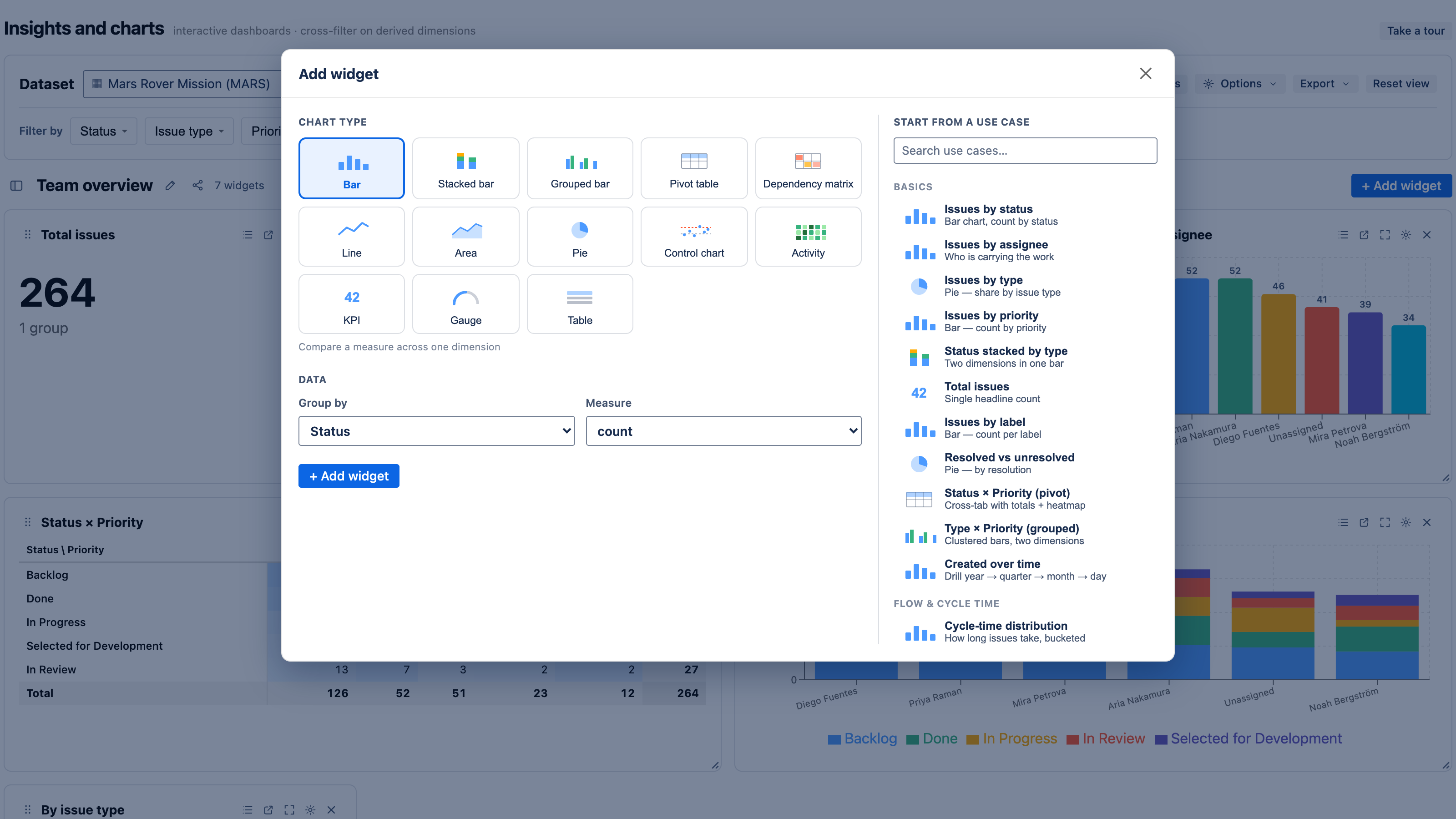
Start from a use case
The gallery on the right of the dialog lists ready-made recipes, grouped by theme (flow & cycle time, agile, epics & points, components & teams, dependencies, and more). Examples: Issues by status, Cycle-time control chart, Velocity — committed vs completed, % within SLA, Dependency matrix.
Pick one and it loads into the builder pre-configured, so you can adjust the dataset scope, dimension, or measure before adding it. This is the fastest way to get a sensible chart and learn what each control does.
Build your own
If you'd rather start from scratch:
- Choose a chart type — bar, stacked, grouped, pie, line, area, control chart (scatter), KPI, gauge, pivot, activity calendar, table, or dependency matrix. See Chart types.
- Group by a dimension — status, assignee, priority, component, epic, sprint, a derived dimension like cycle-time bucket, or a date bucket.
- Measure — pick a stat (count, distinct, sum, average, median, a percentile, min, max) and, where relevant, a field (issue count, story points, or cycle-time days).
Give it a title and click + Add widget. The new chart drops onto the dashboard and is briefly highlighted so you can find it.
See Dimensions & measures for the full catalog of what you can group by and measure.
Tune a widget after adding
Open a widget's ⚙ settings (gear icon on its header) to refine it:
- Size — span one or two columns, and a shorter or taller height.
- Colors — palette, per-segment color pins, and conditional-formatting rules. See Colors & conditional formatting.
- Legend — show or hide it (pie and stacked charts).
- Rename / merge segments — relabel a value, or fold several values into one group.
- Overlays — add a trend line, a moving average, or a cumulative line.
- Reference lines & thresholds — draw a target line, or red/yellow/green bands for KPIs.
- Drill-down hierarchy — define the levels a chart drills through (e.g. issue type → status).
Click a widget's maximize control to view any chart full-screen — useful for dense pivots, control charts, and the dependency matrix.
Rearrange the dashboard
- Reorder widgets by dragging a widget's grip handle.
- Resize a widget with the corner handle, or set an exact span/height in its settings.
Next
- Cross-filtering & drill-down — make the charts interactive.
- Chart types — when to use each one.